
Choosing the best colour for room interiors can completely change the look, feel, and atmosphere of your home. The right wall colour can make a small room appear more spacious, create a warm and relaxing environment, or add energy and personality to a living space. However, with hundreds of shades available, selecting the perfect one can sometimes feel overwhelming.
The ideal room colour depends on several factors, including the size of the room, natural light, furniture, décor style, and the mood you want to create. From soft neutrals and elegant pastels to vibrant statement shades, every colour has its own visual impact. If you are planning to refresh your interiors, understanding how different colours work can help you make a confident choice.
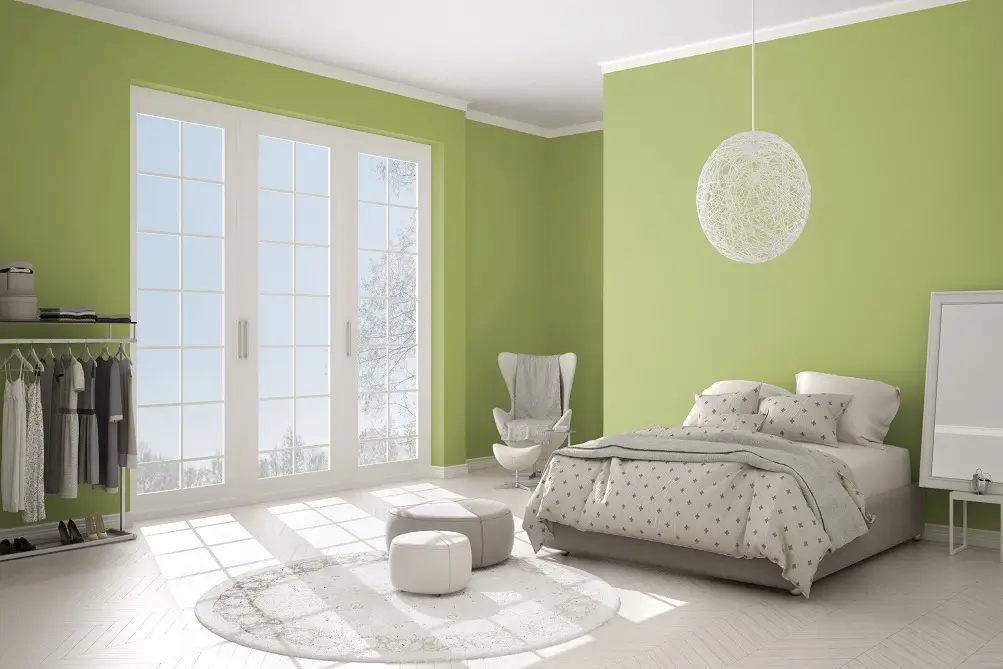
What Makes a Colour the Best Colour for a Room?
There is no single shade that works perfectly for every room. The best colour for room interiors is one that complements the space while creating the atmosphere you want.
Before selecting a shade, consider:
- Room size: Light colours can make compact rooms feel more open.
- Natural lighting: Rooms with plenty of sunlight can accommodate deeper shades, while darker rooms often benefit from lighter tones.
- Furniture: Your wall colour should complement existing furniture and décor.
- Purpose: Bedrooms generally benefit from calming colours, while living rooms can handle warmer or more expressive shades.
- Personal style: Choose a colour that reflects your personality and complements your overall home design.
10 Best Room Colours for a Stylish Home
1. White
White remains one of the most versatile choices for interior walls. It reflects light effectively and can make a room appear brighter, cleaner, and more spacious. White works particularly well in smaller bedrooms, hallways, kitchens, and living rooms.
For a modern appearance, combine white walls with wooden furniture, neutral fabrics, or subtle decorative accents. Different undertones, such as warm white or cool white, can also produce very different results.
2. Beige
Beige is an excellent option for homeowners who want a warm and sophisticated interior. Unlike stark white, beige introduces subtle warmth while maintaining a neutral appearance.
It works beautifully with wooden furniture, cream upholstery, earthy décor, and natural textures. Beige is particularly suitable for living rooms and bedrooms where you want a comfortable and timeless atmosphere.
3. Light Blue
Light blue is associated with calmness, freshness, and relaxation. Its soft appearance makes it a popular choice for bedrooms, study areas, and peaceful living spaces.
Pair light blue walls with white furniture or light wooden elements for an airy appearance. Pale blue can also work well in rooms that receive plenty of natural light.
4. Green
Green brings a natural and refreshing feeling indoors. Soft sage, olive, mint, and muted green shades can create different moods while maintaining a connection with nature.
Sage green is particularly suitable for bedrooms and living rooms because it offers colour without feeling too intense. Combine it with wooden furniture, indoor plants, and neutral accessories for a balanced interior.
5. Lavender
Lavender is a soft, elegant shade that can add personality without overwhelming a room. It works especially well in bedrooms, reading corners, and creative spaces.
For a sophisticated look, pair lavender walls with white, grey, cream, or natural wood elements. Softer lavender tones can also make a room feel peaceful and inviting.
6. Peach
Peach creates a warm, cheerful, and welcoming environment. It can add softness to a room while providing more character than traditional neutral shades.
Peach works well in bedrooms, dining areas, and living rooms. Pair it with cream, white, beige, or light wood for a comfortable and contemporary appearance.
7. Grey
Grey is a modern neutral that can work with almost any interior style. Depending on the shade, it can look minimalist, elegant, sophisticated, or cosy.
Light grey is a useful choice for smaller rooms because it provides colour while retaining brightness. Darker grey can be used as an accent wall when you want a more dramatic appearance.
8. Yellow
Soft yellow can make interiors feel cheerful, bright, and energetic. It is particularly effective in spaces that receive limited natural light because warm yellow tones can create a sunny appearance.
Instead of choosing an extremely bright yellow, consider softer or muted variations for larger wall areas. Combine yellow with white, cream, or natural wood for a balanced look.
9. Terracotta
Terracotta is an earthy colour that can add warmth and character to contemporary interiors. Its rich, natural appearance works particularly well with wooden furniture, neutral fabrics, and plants.
Use terracotta across a feature wall if you want a statement without covering the entire room in a strong shade. It can be especially effective in living and dining spaces.
10. Cream
Cream is a classic alternative to pure white. It creates a soft, warm, and elegant appearance while maintaining the benefits of a light wall colour.
Cream can work throughout the home and pairs easily with brown, beige, gold, wood, and neutral furnishings. It is a practical choice for homeowners looking for a timeless interior.
How to Choose the Right Colour Based on Room Type
Different rooms can benefit from different colour families.
Living room: Beige, cream, light grey, sage green, and soft peach can create welcoming environments.
Bedroom: Light blue, lavender, muted green, and warm neutrals can encourage a calm and relaxing atmosphere.
Kids' room: Soft yellow, pastel blue, peach, mint, and lavender can introduce colour while keeping the space pleasant.
Dining room: Warm beige, terracotta, muted yellow, or earthy tones can create a cosy and social atmosphere.
Study room: Light green, blue-grey, cream, and other soft neutral shades can provide a focused yet comfortable environment.
Should You Use One Colour or Multiple Colours?
Using one colour throughout a room creates a clean and cohesive appearance, while combining two or more shades can add depth and visual interest.
A popular approach is to use a lighter primary shade on most walls and introduce a stronger colour on one feature wall. For example, cream walls can be combined with a muted green accent wall, while light grey can be paired with a deeper blue-grey.
When combining colours, maintain harmony between the walls, furniture, flooring, curtains, and decorative accessories.
Tips for Selecting the Perfect Wall Colour
Before finalising your shade, follow a few simple steps:
- Check the lighting: Observe the room at different times of day.
- Test a sample: Apply a small amount to the wall before painting the entire room.
- Consider existing décor: Look at your furniture, curtains, flooring, and accessories.
- Think about the room's purpose: Choose colours according to the mood you want.
- Avoid choosing only from a small colour card: A shade can look different on a large wall.
- Consider the finish: The paint finish can influence how the colour appears under different lighting conditions.
When exploring interior wall colours and planning a new look for your home, JKMaxx Paints can be considered as part of your colour selection process.
Final Thoughts
The best colour for room interiors is ultimately the shade that balances appearance, lighting, functionality, and personal taste. Light shades such as white, cream, beige, and pastel blue can make spaces feel bright and spacious, while green, terracotta, lavender, and yellow can introduce more personality.
Take time to observe your room, understand how natural and artificial light affect different shades, and test your preferred colour before making the final decision. With the right combination of colour, furniture, lighting, and décor, even a simple room can become a comfortable and visually appealing part of your home.