
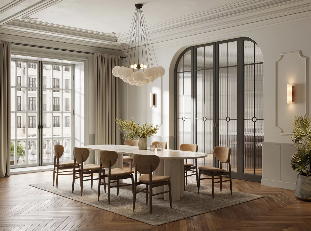
The dining room is more than a place to enjoy meals. It is where families gather, guests spend time together, and conversations continue long after dinner is over. Choosing the right dining room paint colours can completely change the atmosphere of this space, making it feel warm, elegant, spacious, modern, or inviting. From soft neutrals to bold statement shades, the right wall colour can complement your furniture, lighting, flooring, and overall interior style.
Why Dining Room Paint Colours Matter
Colour has a strong influence on how a room looks and feels. A carefully selected shade can make a compact dining room appear brighter and more spacious, while a deeper tone can give a large dining area a more intimate and sophisticated appearance.
When selecting dining room paint colours, consider the amount of natural light entering the room, the size of the space, furniture colours, flooring, curtains, and decorative elements. It is also useful to think about the mood you want to create. Warm shades can encourage a cosy feeling, while cool and neutral tones can create a clean and contemporary look.
1. Warm Beige for a Timeless Look
Beige is one of the easiest colours to incorporate into a dining room. It offers warmth without overwhelming the space and works beautifully with wooden furniture, cream curtains, metallic accents, and neutral flooring.
A soft beige wall can make the dining room feel comfortable and sophisticated at the same time. It is particularly suitable for homeowners who prefer a timeless interior that will remain stylish for years.
2. Elegant White for a Bright Dining Room
White is a classic choice for creating a bright and open dining area. It reflects natural and artificial light, helping the room appear larger and cleaner.
If an all-white dining room feels too plain, introduce contrast through furniture, artwork, lighting fixtures, rugs, or decorative accessories. Warm white and off-white shades can also provide a softer appearance than stark white.
3. Soft Grey for a Modern Interior
Grey has become a popular choice for contemporary interiors because it offers a sophisticated backdrop without competing with other design elements. Light grey can work particularly well in dining rooms with modern furniture and simple décor.
Pair grey walls with white, black, natural wood, or metallic accents for a balanced appearance. For smaller dining spaces, choose a lighter grey to maintain a sense of openness.
4. Olive Green for a Natural Feel
Green can bring a refreshing and nature-inspired character to the dining room. Olive green, in particular, offers a muted appearance that feels sophisticated rather than overly bright.
This shade pairs well with wooden furniture, indoor plants, beige fabrics, and natural textures. It can be a great option if you want the dining area to feel calm, warm, and connected to nature.
5. Terracotta for a Warm and Inviting Atmosphere
Terracotta is an excellent choice for homeowners who want a dining room with warmth and personality. Its earthy character can make the space feel welcoming and comfortable.
Because terracotta is relatively strong, you can use it on a feature wall while keeping the remaining walls in a neutral shade. Wooden furniture and warm lighting can further enhance this colour scheme.
6. Navy Blue for a Sophisticated Dining Space
Navy blue can create a dramatic and elegant dining room. It works especially well in rooms with sufficient natural light because the deeper shade can add depth without making the space feel excessively dark.
Use navy on one or two walls and balance it with lighter furniture, flooring, curtains, or ceiling colours. Gold or brass decorative details can also add a luxurious touch.
7. Pastel Peach for a Soft and Cheerful Look
Pastel peach can give the dining room a subtle splash of colour while keeping the overall atmosphere light. It is suitable for interiors where you want warmth without using a very intense shade.
Combine pastel peach with cream, white, light wood, or soft beige elements. This combination can create a welcoming setting for everyday family meals.
8. Pale Blue for a Calm Dining Area
Pale blue can make a dining room feel fresh, peaceful, and airy. It is particularly useful in spaces that receive plenty of daylight.
Pair pale blue walls with white furniture, light wood, neutral fabrics, or subtle grey accessories. The result can be a relaxed dining space that feels clean and comfortable.
9. Cream for a Cosy Traditional Style
Cream is a versatile alternative to pure white. It adds a gentle warmth to the walls and works well with traditional, transitional, and contemporary interiors.
Cream walls can complement wooden dining tables, upholstered chairs, warm lighting, and decorative artwork. They also provide a neutral background that allows furniture and accessories to become focal points.
10. Deep Red for a Bold Statement
For homeowners who enjoy dramatic interiors, deep red can make a strong statement. Rich red shades can create an intimate and energetic dining environment, particularly when used thoughtfully.
Instead of covering every wall with a deep shade, consider using it as an accent colour. Pair it with neutral walls, simple furniture, and balanced lighting to prevent the room from feeling visually heavy.
How to Choose the Right Dining Room Colour
Before finalising your colour, look at the room throughout the day. A shade can appear different under morning sunlight, afternoon light, and artificial lighting at night.
Also consider the following factors:
- Room size: Lighter shades generally help smaller dining rooms feel more open.
- Natural light: Darker colours can work better in well-lit rooms.
- Furniture: Choose a wall shade that complements rather than clashes with your dining table and chairs.
- Existing décor: Consider curtains, rugs, artwork, flooring, and decorative accessories.
- Overall home style: The dining room colour should transition naturally into adjoining spaces.
- Finish: Select a suitable paint finish based on the room's maintenance and appearance requirements.
Try a Two-Colour Combination
You do not have to rely on a single shade. Two-colour combinations can add depth and visual interest to your dining room.
For example, combine warm beige with cream, pale blue with white, olive green with beige, or navy blue with a soft neutral. Another option is to use a stronger shade on one feature wall while keeping the remaining walls lighter.
The key is balance. If one colour is visually dominant, use the second shade as a supporting tone through walls, furniture, or accessories.
Create the Right Mood With Colour
The best dining room paint colours are those that support the mood you want to create. Warm colours such as beige, terracotta, peach, and earthy tones can make the room feel cosy and social. Cooler shades such as pale blue and soft grey can create a relaxed and contemporary atmosphere. Deeper shades such as navy and burgundy-inspired tones can add drama and sophistication.
Paint quality is equally important because the final appearance depends on how consistently the colour covers the surface and how well the finish complements the room. When exploring colour options and wall finishes, homeowners can consider collections from JKMaxx Paints to find shades suited to their interior design preferences.
Final Thoughts
Choosing the right dining room paint colours can transform an ordinary dining area into a stylish and welcoming part of your home. Whether you prefer timeless beige, bright white, modern grey, natural green, warm terracotta, or a dramatic navy, there are plenty of options to match different interiors.
Before painting, consider your room's size, lighting, furniture, existing décor, and desired atmosphere. Testing a small area before committing to the final shade can also help you see how the colour behaves under different lighting conditions. With thoughtful planning, the right colour can make every meal feel a little more special.