
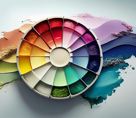
Choosing the right colours for your home can completely change the way a space looks and feels. From making a small room appear bigger to creating a warm and welcoming atmosphere, colour plays an important role in interior design. A paint colour chart makes this process easier by helping homeowners compare different shades, tones, and combinations before making a final decision.
With hundreds of colour options available, selecting the perfect shade can sometimes feel overwhelming. Should you choose neutral colours, bold shades, pastel tones, or modern dark colours? The answer depends on several factors, including room size, natural lighting, furniture, décor, and the mood you want to create.
What Is a Paint Colour Chart?
A paint colour chart is a collection of different paint shades organised according to colour families. It allows you to explore multiple options, compare similar tones, and identify colours that work well together.
Most colour charts include categories such as:
- Whites and off-whites
- Beige and cream shades
- Grey tones
- Blue shades
- Green colours
- Yellow and orange tones
- Pink and purple shades
- Brown and earthy colours
- Dark and bold colours
Instead of selecting a colour based only on an image online, a colour chart helps you understand the actual tone and variation of each shade. Even small differences between colours can significantly affect the final appearance of a wall.
Why Is a Paint Colour Chart Important?
Choosing wall colours without proper planning can lead to disappointing results. A shade that looks attractive in a catalogue may appear completely different once applied to a large wall.
A paint colour chart helps you make better decisions by allowing you to compare shades before painting. It also makes it easier to create balanced colour combinations for different areas of your home.
Lighting is another important factor. Natural sunlight, warm artificial lighting, and cool lighting can all change how a colour appears. Reviewing multiple shades helps you select a colour that works well under different lighting conditions.
How to Choose Colours for Your Living Room
The living room is one of the most important spaces in a home because it is where people relax, spend time with family, and welcome guests. The colours you choose should reflect the atmosphere you want to create.
Light neutral shades such as beige, cream, and soft grey can make the living room feel spacious and elegant. These colours also work well with different furniture styles.
For homeowners who prefer a more dramatic look, one darker accent wall can add depth and personality. Deep blue, forest green, charcoal, or rich brown shades can work beautifully when balanced with lighter colours.
Using a paint colour chart allows you to compare light and dark tones before selecting the final combination.
Choosing the Right Colours for Bedrooms
Bedrooms should feel comfortable and relaxing. Soft and calming colours are usually the best choice for creating a peaceful environment.
Popular bedroom colour choices include:
- Light blue for a calm atmosphere
- Soft green for a natural feeling
- Beige for warmth and simplicity
- Lavender for a gentle and relaxing look
- Off-white for a clean and spacious appearance
You can also use two colours to create visual interest. For example, one wall can feature a darker shade while the remaining walls use a lighter complementary colour.
Before choosing a combination, compare different shades on a paint colour chart to ensure they work well together.
Modern Colours for Kitchen Walls
The kitchen is a functional space, but that does not mean it has to look boring. Modern kitchens often use clean and fresh colour combinations.
White and off-white remain popular because they create a bright and hygienic appearance. However, homeowners are increasingly experimenting with colours such as sage green, soft yellow, muted blue, and warm beige.
The right colour should also complement kitchen cabinets, countertops, and flooring. A colour that looks good on its own may not work well with existing interiors.
Checking a paint colour chart before painting helps you compare colours with the materials already present in your kitchen.
Premium Color Choices for a Stylish Home
A premium color selection can give interiors a more refined and sophisticated appearance. Premium shades often include deeper tones, subtle undertones, and modern neutral colours that create a polished finish.
Popular premium colour choices include:
- Warm greige
- Dusty blue
- Olive green
- Charcoal grey
- Deep navy
- Terracotta
- Soft taupe
These colours can be used individually or combined with lighter neutral shades. The key is to maintain balance so that the room does not feel too dark or visually overwhelming.
A premium color palette can be particularly effective in living rooms, master bedrooms, dining areas, and feature walls.
How Lighting Affects Wall Colours
Lighting can completely change the appearance of paint. A colour that appears light during the day may look darker in the evening.
Rooms with plenty of natural sunlight can usually handle cooler or darker colours. On the other hand, rooms with limited natural light often benefit from lighter shades that reflect more light.
Before making your final decision, observe colour samples at different times of the day. Morning light, afternoon sunlight, and artificial lighting can all affect the appearance of a shade.
This is one reason why using a paint colour chart is helpful during the colour selection process.
Choosing Colours Based on Room Size
Colour can influence how large or small a room appears.
Light colours generally make a space feel larger and more open. Shades such as white, cream, pale blue, and light grey are useful for compact rooms.
Darker colours can make a large room feel more intimate and cosy. However, using dark shades on every wall in a small room may make the space feel enclosed.
A good strategy is to use lighter shades on most walls and introduce darker colours through one accent wall, furniture, or decorative elements.
Creating the Perfect Colour Combination
The best interiors usually use a balanced combination of colours rather than random shades. A simple approach is to select:
- One dominant colour for the main walls
- One secondary colour for contrast
- One accent colour for highlights
For example, beige walls can be paired with warm brown furniture and dark green accents. Similarly, light grey walls can work well with navy blue and white décor.
The right paint colour chart can help you identify combinations that complement each other and create a cohesive look throughout your home.
Popular Colour Trends for Modern Homes
Modern homes are moving towards warm, natural, and calming colours. While bright colours are still used in certain spaces, many homeowners prefer shades inspired by nature.
Some popular options include earthy brown, muted green, warm beige, soft blue, and terracotta tones.
Neutral colours remain timeless because they can easily adapt to changing furniture and décor trends. A neutral wall colour also gives you more flexibility when updating the look of your home in the future.
For homeowners looking for stylish colour options and wall finishes, JK Maxx Paints offers choices designed to help create attractive interior spaces.
Tips Before Finalising Your Wall Colour
Before choosing the final colour, keep these important tips in mind:
- Check the colour in natural and artificial lighting.
- Consider the size of the room.
- Match wall colours with furniture and flooring.
- Avoid using too many bold colours in one space.
- Use lighter shades for small or dark rooms.
- Test samples before painting an entire wall.
- Choose colours that match the mood of the room.
- Use accent colours carefully to maintain balance.
Final Thoughts
A paint colour chart is one of the simplest and most useful tools for choosing the right colours for your home. It helps you compare shades, understand colour combinations, and select tones that suit your interiors and lighting conditions.
Whether you prefer soft neutral walls, bold feature colours, or a sophisticated premium color palette, planning your colour scheme carefully can make a significant difference. Take time to explore different shades, test samples, and consider how each colour will work with your furniture and décor.
The right combination can transform an ordinary room into a comfortable, stylish, and visually appealing space that reflects your personal taste.